LOGO'S GONE WRONG
Added on: 23rd Oct 2013
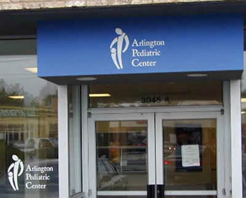
Arlington Pediatric Center
The Arlington Pediatric Center is certainly gaining some unwanted publicity
when this logo design gone impossibly wrong.
While the center may employ wonderful physicians, the public will forever
misperceive its services because of this tragic logo.
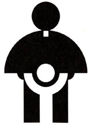
Catholic Church’s Archdiocesan Youth Commission
This logo was developed in 1973 and won an award from the
Art Director’s Club of Los Angeles.
This example shows how perception can adjust overtime with new generations
viewing things much differently from their predecessors.
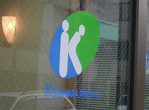
Kudawara Pharmacy
No explanation is needed on why this logo from Kudawara Pharmacy
has gained such widespread public attention.
It leaves one wondering what services are offered inside those doors.
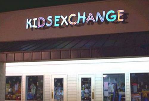
KidsExchange
Proper capitalization and a space between the words of the
KidsExchange logo could have saved this company a great deal of embarrassment.
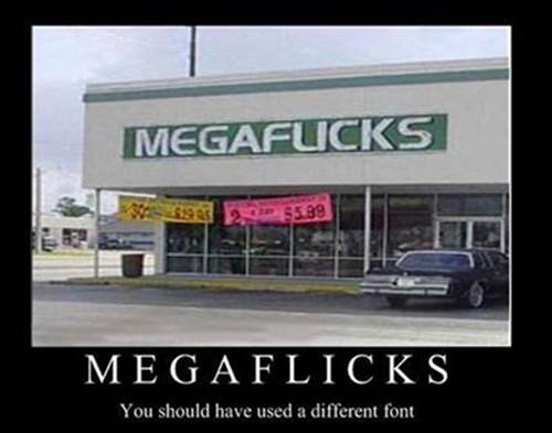
MegaFlicks
Many customers may think twice about entering a
MegaFlicks store after reading this logo.
Lesson to learn: Use fonts carefully or you may regret the results.
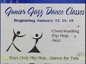
Junior Jazz Dance Class
The black-and-white images in this logo create an unintended optical illusion.
One begins to wonder if it’s a junior dance center or an adult entertainment club.
Instituto de Estudos Orientais
This logo was intended to portray the sun behind a yellow building,
but the simple use of two black lines on the building’s roof creates a very different image.

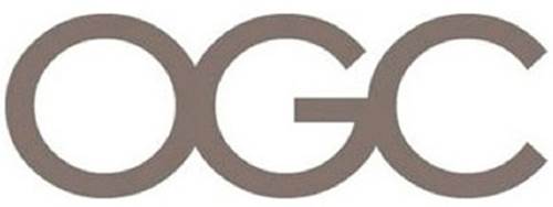
Office of Government Commerce
Even the simple use of three letters to create a logo can generate public outrage.
Rotate the logo 90 degrees clockwise and suddenly
a very different image appears.
The most unfortunate aspect of this logo is it’s still being used by the agency.
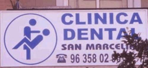
Clinica Dental
After releasing this logo, Clinica Dental is likely now jokingly
referred to as a ‘full-service’ practitioner.
Comment on this